“Conference Cliff Notes” is a series of short blog posts summarizing takeaways and ideas from NACTO’s 2023 Designing Cities Conference in Denver. Read more about the conference here.

Transportation planners and engineers know how to use data to make strategic decisions. But data—when presented thoughtfully—can also be a powerful communications tool, helping to illustrate disparities, explain changes over time, or make the case for investment to both decision-makers and the public.
Attendees explored this intersection of data and storytelling in “When Numbers Talk,” a breakout session at the #NACTO2023 Designing Cities Conference, where planners and advocates shared the ways they’ve used data to tell stories about transportation in their cities, and to shift narratives in order to make change.
Cities often have treasure troves of great data, but numbers alone aren’t enough, explained Nick Sifuentes, Sustainable Cities Program Director at the Summit Foundation and the session moderator. To be communicated effectively, facts and figures must be framed with good messaging techniques targeted toward a clearly-defined audience.
“The ‘general public’ is almost never your audience,” Sifuentes said. “They’re huge, inchoate, heterogenous, and often it’s impossible to move everyone. Instead, it’s the groups or individuals who are both necessary to help you achieve your goals and are receptive to your messages.”

View more slides from this presentation. >
In his previous role as Executive Director of the Tri-State Transportation Campaign (TSTC), Sifuentes oversaw an advocacy campaign to push for approval of New York’s congestion pricing plan. In that context, the key audience included the members of New York’s state legislature who would vote on the proposal, as well as those legislators’ voting constituents. With those audiences in mind, TSTC used data from the Census, American Community Survey, and AASHTO to produce analyses of individual State Senate and Assembly districts showing that only small percentages of commuting residents traveled by car into the tolled zone of Manhattan, while far higher numbers of commuters relied on public transit, and therefore stood to benefit from the program.
“We took a fairly cynical approach, assuming that the number one thing electeds care about is, you know, getting re-elected,” Sifuentes said. “Because of this, we assumed they would be motivated by how many people in their district would have to pay a new toll that would potentially anger them, and how many people in their district would benefit from better transit funded by congestion pricing.”

TSTC strategically used neighborhood-level and county-level analyses to make the argument to the press, to constituents at town halls and hearings, and to elected officials in one-on-one meetings with transit riders who had taken hits to their income due to train and bus delays. It worked; the state legislature voted to approve a congestion pricing plan as part of its 2019 budget.
These data storytelling strategies aren’t just for advocates; they can work for transportation agencies, too.
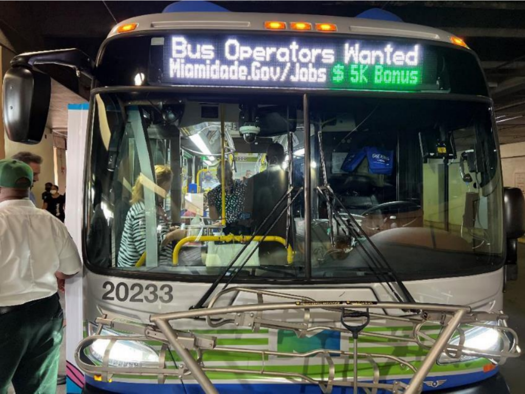
When making the case for its bus network redesign, the team at Miami-Dade County Transportation & Public Works had to convince three distinct audiences: riders that had lost trust in the agency after failed promises of the past, the transit operators’ union, and county commissioners without much transportation expertise.
“Our work is squeezed between everything from animal control to septic and sewage,” said Linda Morris, Miami-Dade’s Chief of Service Planning and Scheduling. “Everyone loves puppies and knows they don’t want to see poop. But our county commissioners don’t know that much about transit.”
Morris’ team took these differing knowledge levels into consideration when crafting its data communication strategy, using visualizations that would resonate with each audience by acknowledging the current system’s shortcomings; clearly defining problems, proposed solutions, and tradeoffs; and building trust through transparency.


In this way, Miami-Dade was able to demonstrate that its old network was duplicative and inefficient, and that a re-design would simultaneously streamline routes while better connecting residents to employment centers and other hubs.
Similarly, Austin crafted a data communications strategy that simultaneously targeted both external audiences and decision-makers within the agency itself. In the aftermath of the murder of George Floyd in 2020, practitioners at the Austin Transportation & Public Works Department (TPW) wanted to do more to highlight and address the racial disparities among serious injury and fatal crash victims in the city. After weekly discussions amongst a group of TPWstaffers and a dive into the agency’s past programs and investments, TPW’s Vision Zero team created “Safe for All,” an interactive virtual report that uses data visualizations, maps, historical photos and resident testimonies to explain the role transportation and land use decisions have played in perpetuating racial inequities in Austin.
Among other important stories, the “Safe for All” report demonstrates not only the historical impact of policies like redlining, deed restrictions and the construction of the Interstate Highway System, but the ways in which those earlier decisions shape present-day realities.
“We’re making the historical connection to current conversations,” explained Joel Meyer, Vision Zero Program Manager at TPW. “Historically-redlined communities now suffer from higher rates of traffic fatalities and the state department of transportation is proposing to widen a major highway through Central Austin once again.”
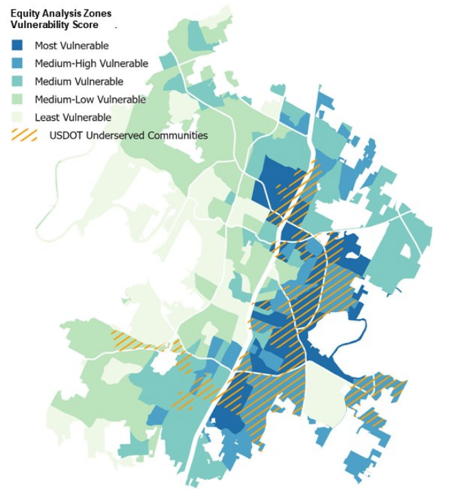
Since publishing the first Safe for All StoryMap in early 2021, TPW has worked with members of the Austin community to develop a new tool – Equity Analysis Zones (EAZ) – to assist staff in analyzing and considering equity in transportation processes and decision-making.
Crucially, Austin paired its quantitative data with individual anecdotes and stories of Austinites who have been impacted by unsafe streets.
“We want to not just use quantitative data, but also photos and testimonials, so people who’ve been impacted by crashes can tell their stories,” Meyer said. “We want to make clear these aren’t just statistics, but people you know and care about.”
In Washington D.C., the District Department of Transportation (DDOT) has also used storymapping tools to communicate and advance Vision Zero goals. The agency’s data dashboards provide transparent, trackable, and up-to-date information that DDOT uses to advocate for more funding for our transportation projects, and to show progress to residents, elected officials, the media and agency staff itself. These dashboards illustrate work across several key initiatives, including the Safety Intervention Dashboard, the Annual Safety Improvement Program, and the Traffic Safety Input (TSI) Program 2.0.

Key to using these dashboards effectively, explained Amanda Stout, Deputy Chief Project Delivery Officer at DDOT, is to recognize that different programs and projects require different methods of presenting information. For example, more nimble, tactical projects allow the agency to showcase results more quickly, but it’s also crucial to communicate progress on longer-term capital infrastructure projects. Similarly, data visualization helps the agency balance its focus on “reactive” and “proactive” projects, and ensure it’s both closing out request-based work while also meeting larger citywide needs.

“Often, much of the request-based work comes from wealthier and whiter areas,” Stout said. “But we’re using data to be proactive so requests alone don’t drive our decision-making.”
Using community data to inform policy and design choices is also crucial for Jénesis Gallego, Communications & Design Lead at the New York City Department of Transportation, who makes uses information gathered during public outreach to “tell the community’s story in a way that is useful for the project managers, planners, and decision-makers, but maintains the humanity of the data.”
The agency surveyed hundreds of lower Manhattan residents, workers and visitors to inform its visioning project for Canal Street, a corridor with large pedestrian counts that is nevertheless dominated by large vehicle lanes that link crosstown traffic with the Holland Tunnel and Manhattan Bridge.

Gallego’s team found most respondents preferred walking to access businesses and other activities on Canal Street, and that narrow, crowded sidewalks were pedestrians’ biggest safety concern, information they were able to communicate to other NYCDOT teams working on the corridor.
Used thoughtfully, data can be a powerful storytelling tool to change narratives and make the case for investment in sustainable transportation infrastructure. When presented as part of a clear narrative to the right audiences, data has the power to reshape the conversation.